Episode
Podcast discovery app that focused on surfacing episode recommendations curated from charts, editors and social signals
I was the sole product designer working directly with the CEO doing 0 to 1 design, writing smoke tests, developing user feedback loops and managing weekly surveys & emails. We were acquired by Medium.
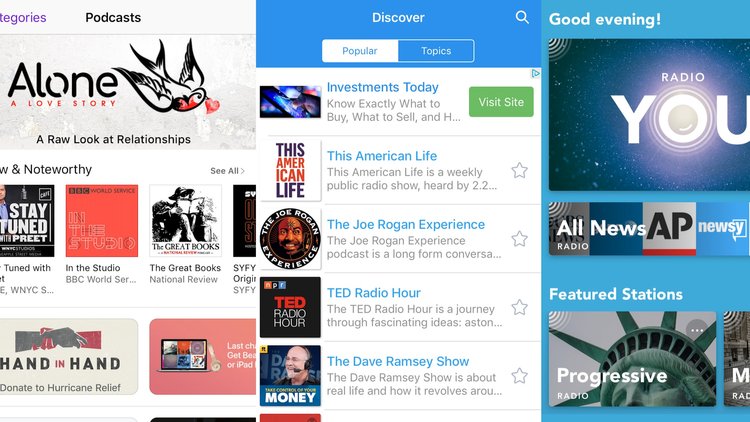
Podcast listening hadn’t grown much because it’s hard to find new ones and they feel less important.
Exploring different podcast apps showed us issues like not enough variety in suggestions, messy metadata, only focusing on full shows which could mean missing good episodes, and everyone relying on Apple Podcasts.
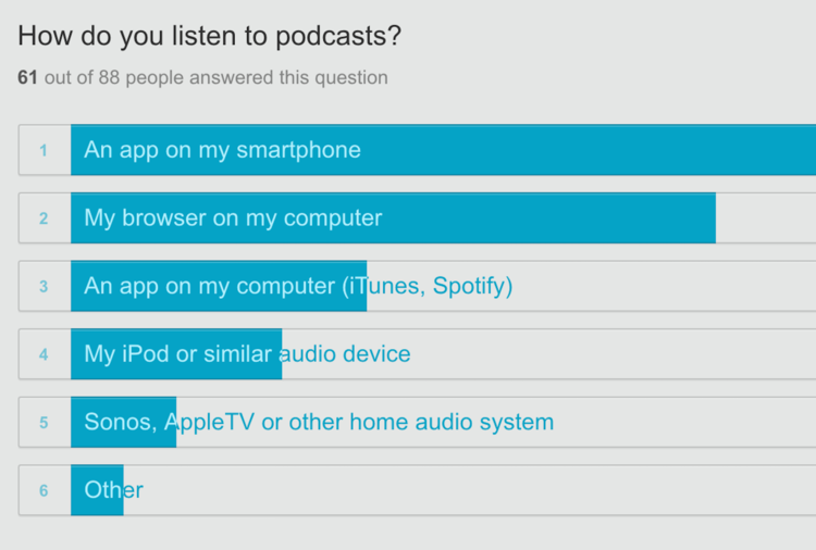
We made ads in 6 cities targeting different types of people. We aimed to have 20+ people in each city fill out a podcast survey. We then selected a group of users for a phone interview. Users were chosen based on their survey responses and our plan to include people of different ages, genders, tech knowledge, and podcast experience.
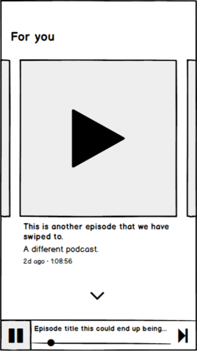
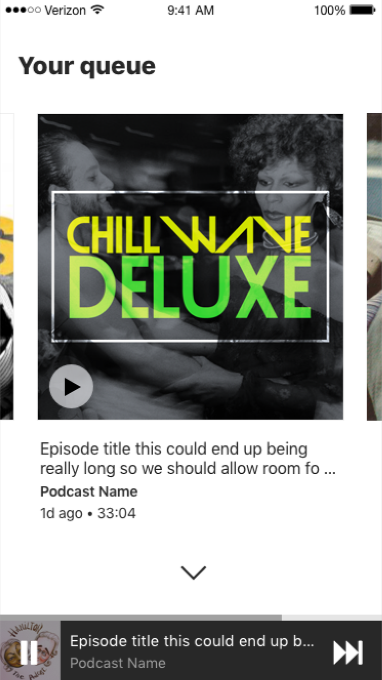
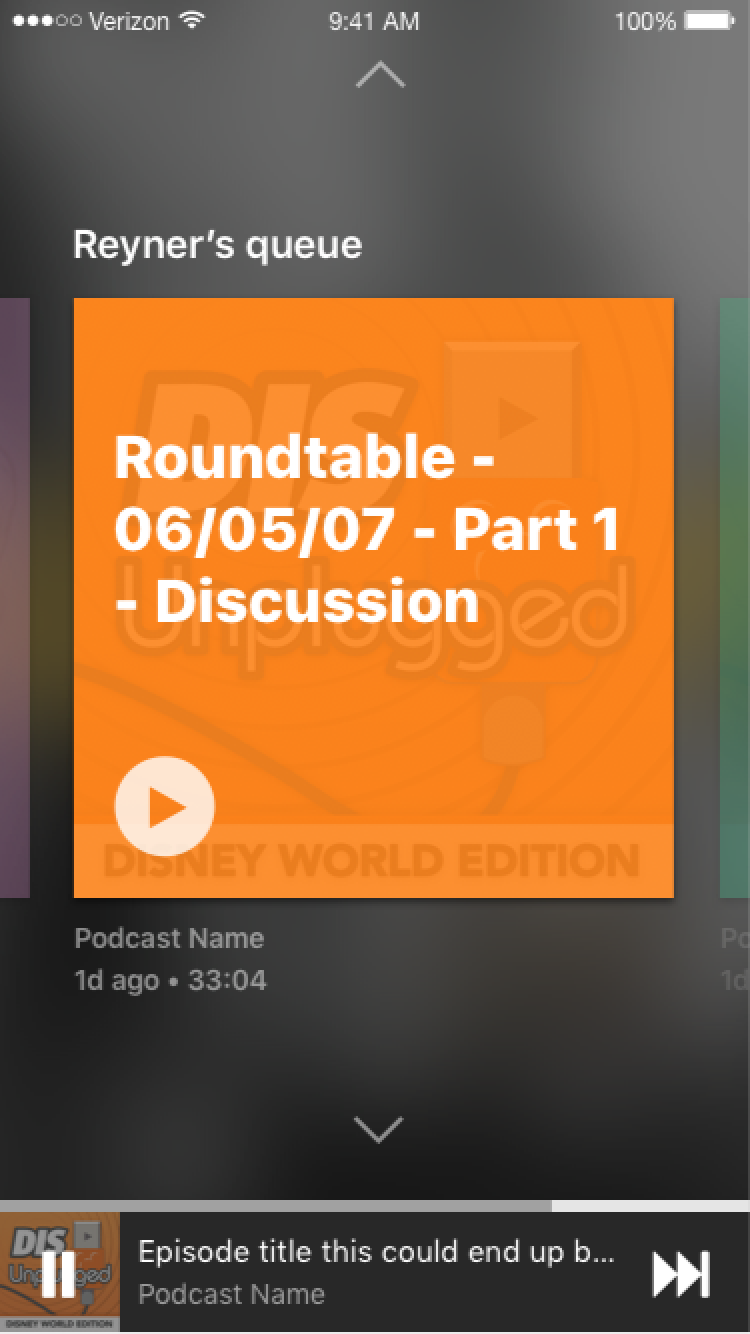
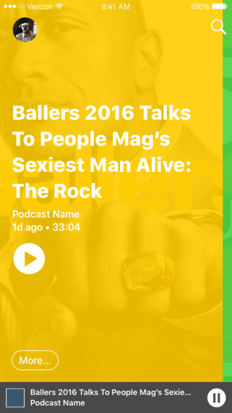
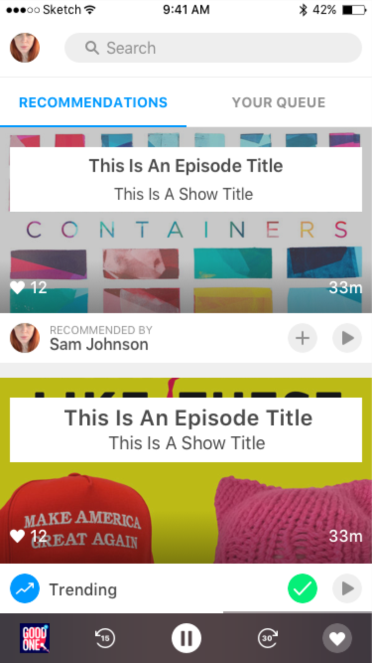
We decided our initial core action hypothesis would be PLAY.
How might we understand what a Listener needs to see to tap ‘play’?
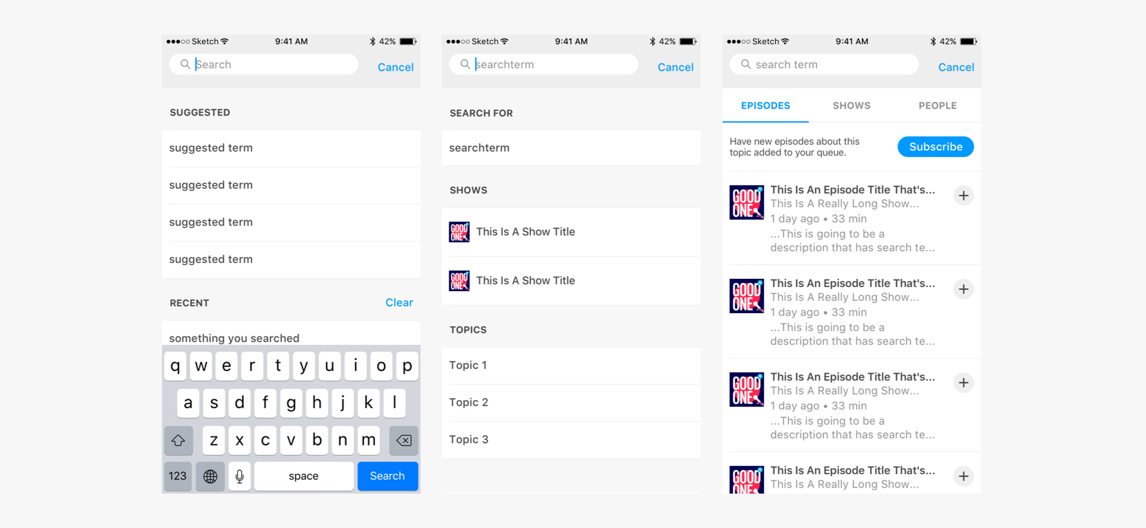
For initial testing we wanted to get something that pulled in actual episodes and the relevant metadata to see where holes (bad data, empty sets) might be.
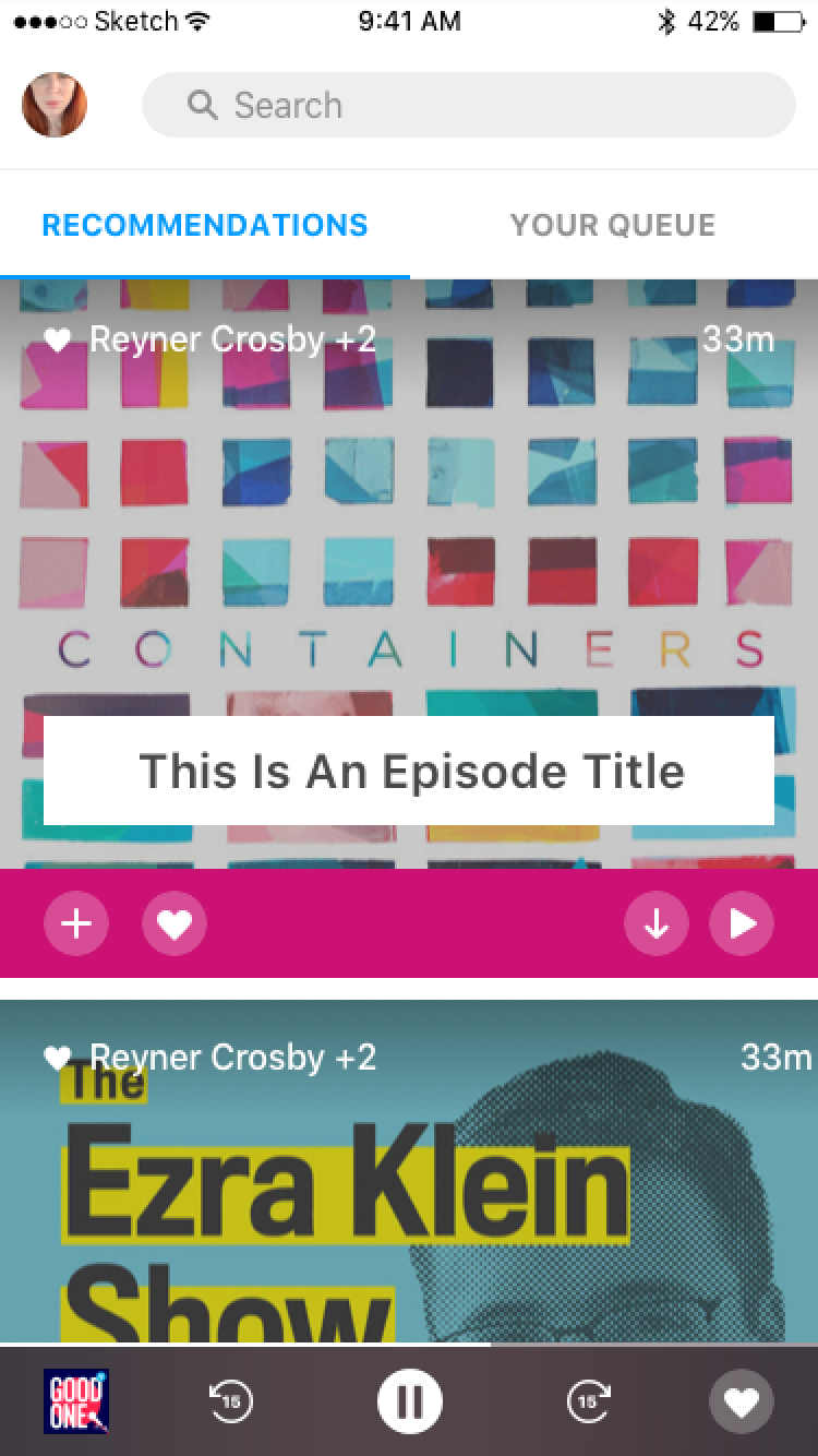
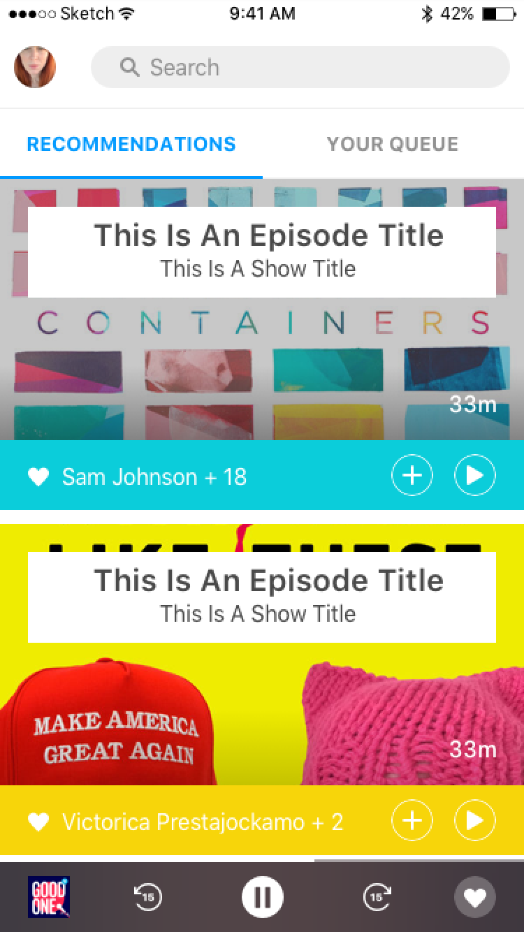
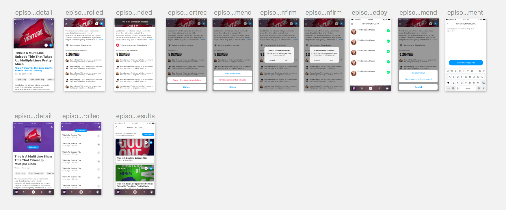
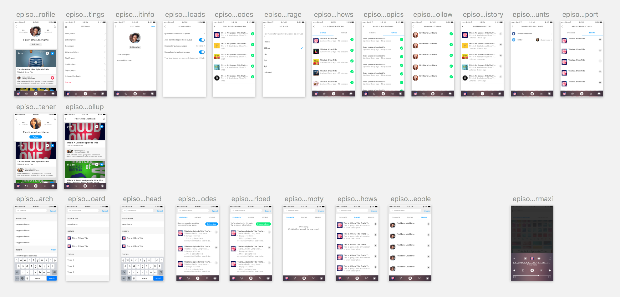
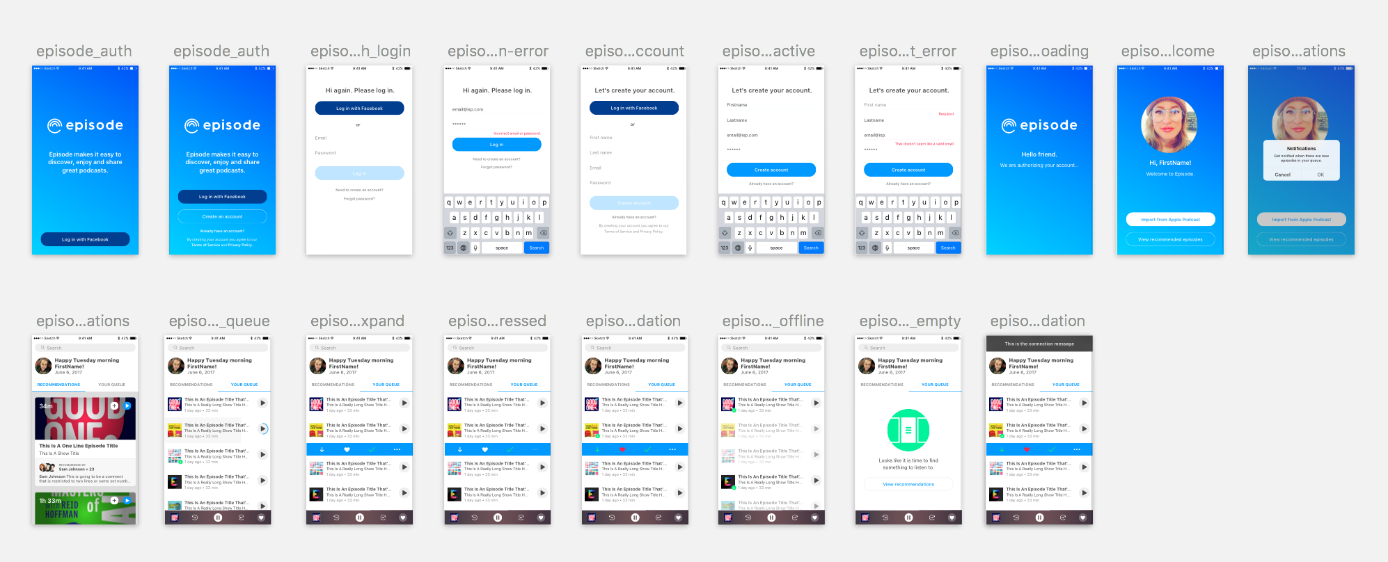
We spent time iterating queue ideas with the goal of learning what was crucial for a listener to perform the core action. We were on track until we got distracted by solving problems we assumed were there. Things like do listeners want a single item displaying in their queue at a time or the ability to browse many?
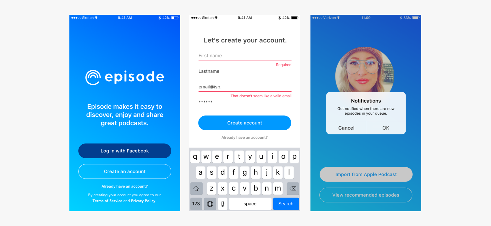
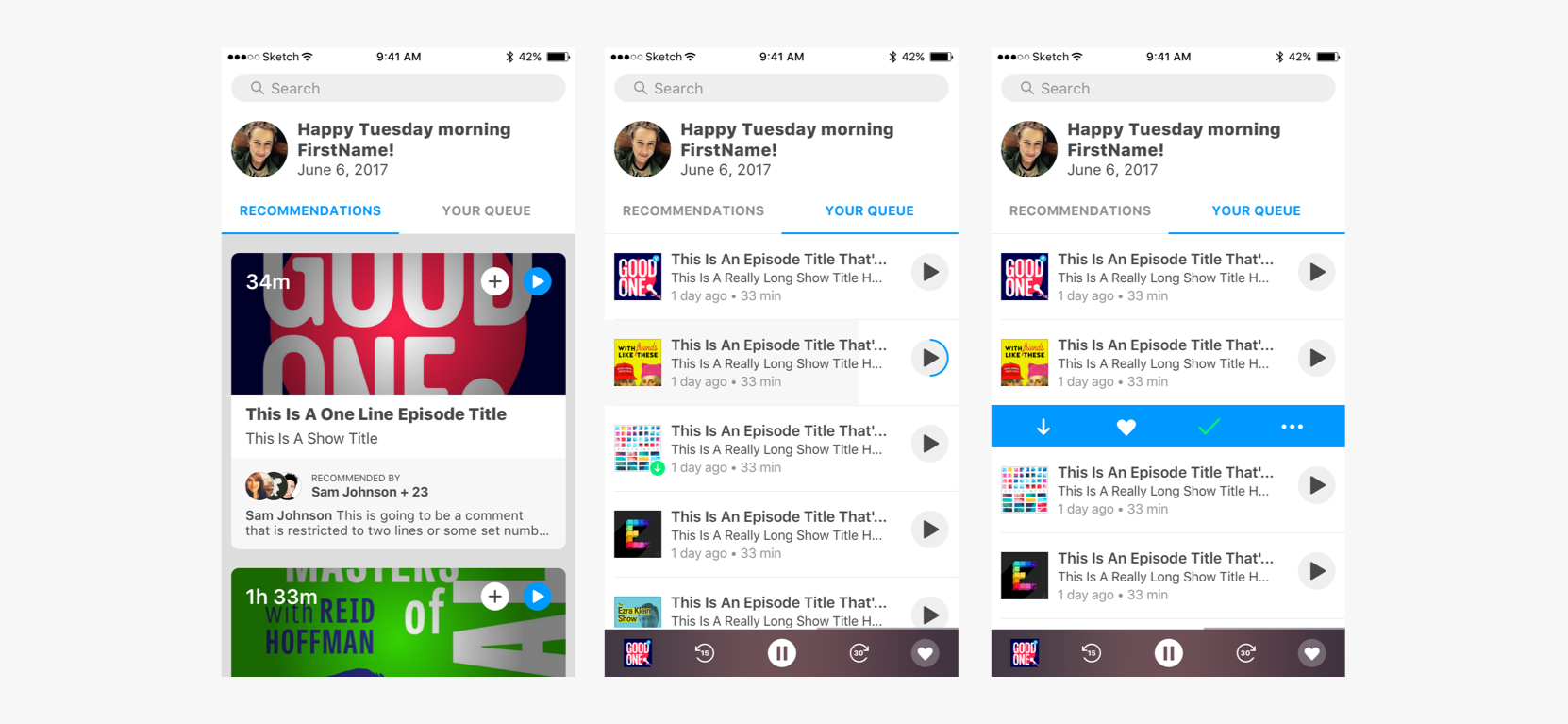
We launched with a full screen queue and less abstract navigation. Recommendations were hidden in the Search view.
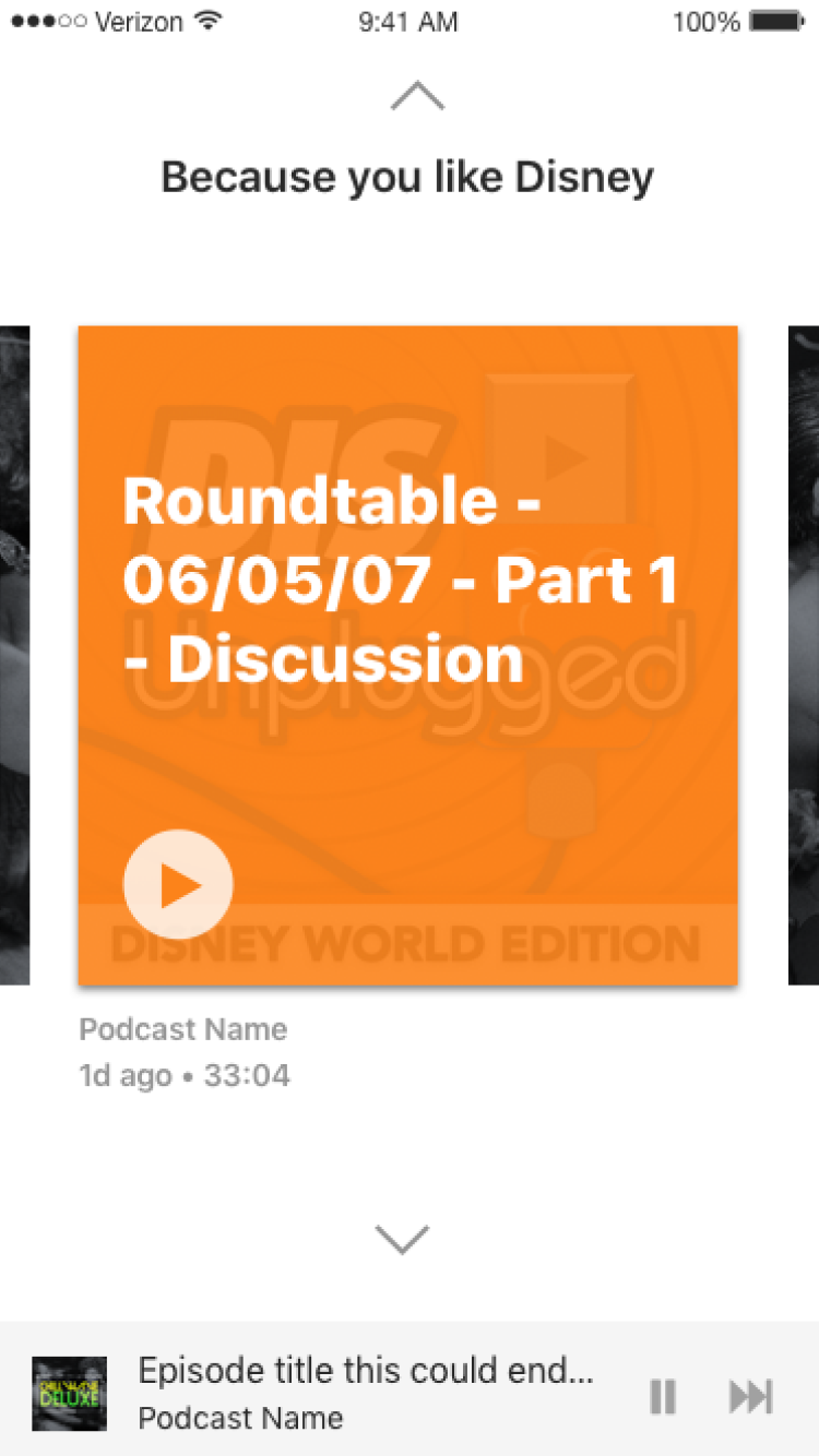
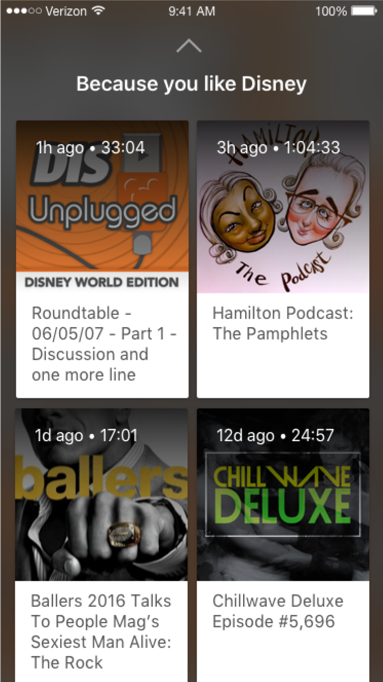
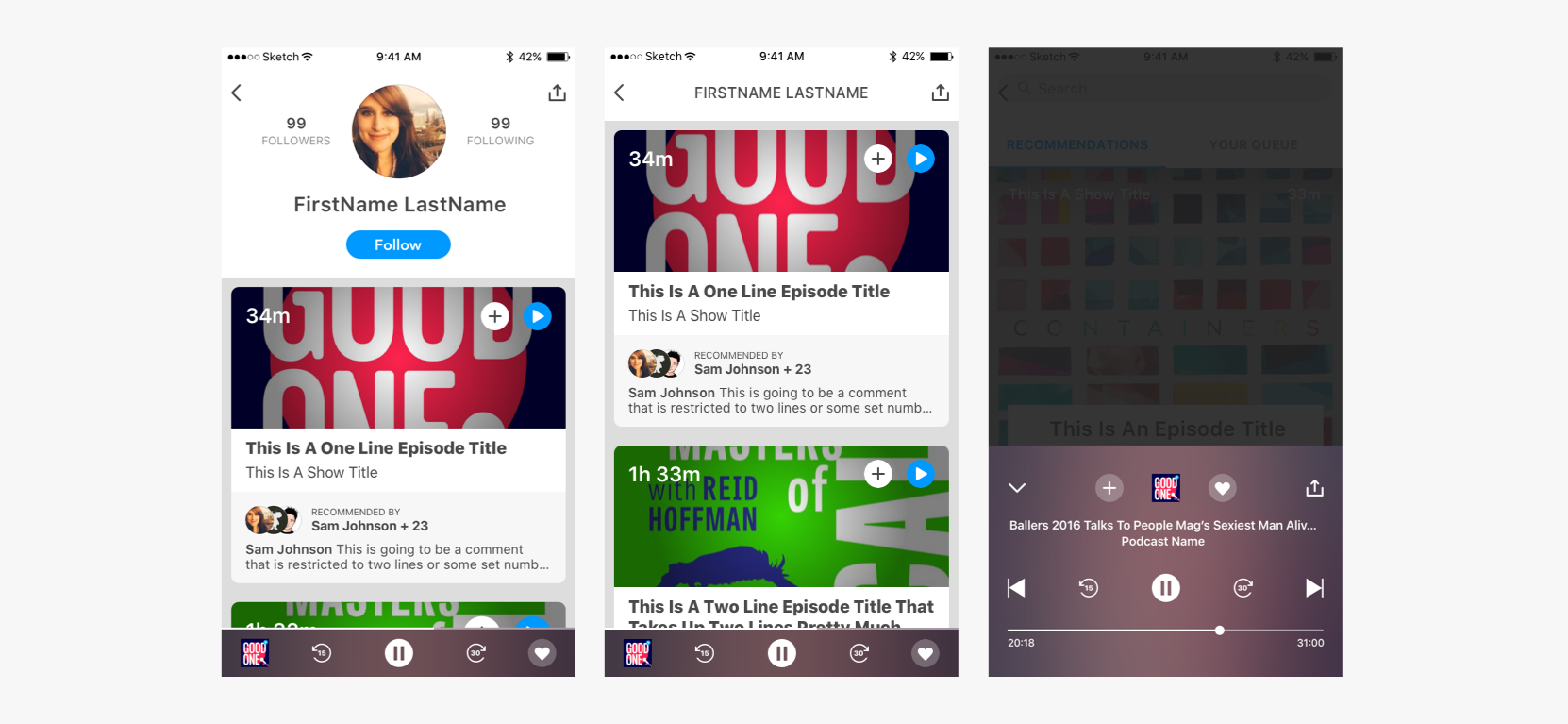
We quickly identified the need to show why a listener suggested an episode. Recommendations became important and got highlighted.
How can we best visualize our progress to minimize gaps in logic?
It’s common and risky to get too attached to your product, forgetting how it feels to see each screen for the first time. You are equally likely to neglect the increasing repetitiveness of steps and actions for established users. Focusing on how each step connects and considering various user stories is key to the product’s success.
Organizing the layout helped us spot gaps. Building prototypes allowed us to test usability efficiently.
How can we help our testers and keep getting better through what we learn?
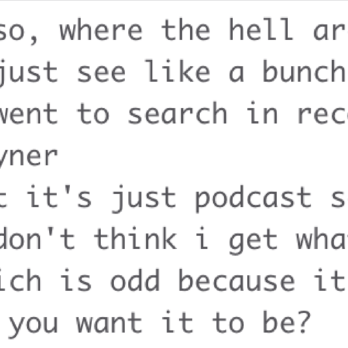
Our beta testers could discuss feedback, make suggestions, report bugs and issues or ask questions directly via a private Slack channel.
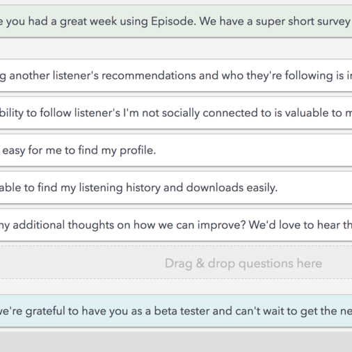
A weekly Wednesday release schedule was supported with an email driving listeners to perform specific tasks as beta testers. A short survey based on that week’s tasks was sent on Mondays.
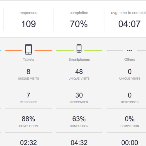
Analytics helped develop action items and drive prioritization.
Let’s get it up and get folks using it!
This isn’t the time to be pixel precious or afraid to release something that’s not ‘perfect’!
Pro tip: Your product will always be a moving target and that’s a good thing.
What we did right
Identifying the problem we wanted to solve and consistently measuring the roadmap and each release against that problem to discern whether we were still on task.
Identifying a core action and evolving the UI around that.
Transparency amongst the team and with our listeners and including everyone in the process from the start.
Continuing to interview new segments of listeners, recognizing you can always learn more.
Being unafraid of releasing pixel imperfect UI or unproven UX for the greater good of learning quickly.
What we did wrong
Spending too many cycles on trying to create innovative navigation. Goal was simplifying UX but it ended up eating too much time and not any real payoff.
Neglecting cycles to mine the metadata and identify potential variables that could be added to the algorithms.
Increasing percentage of beta testers that completed weekly tasks and survey thru better follow up and organization.
Overcomplicating the Design Language Library too soon in the process.
